For those who don’t know, the Mandela Effect is a viral phenomenon where large groups of people share a false memory. The name was coined by Fiona Broome, who realized after speaking to people at a paranormal conference that they all shared the false memory of Nelson Mandela dying in prison. The name caught on, and slowly but surely, every common misconception, misquoted movie line, or misspelled word became part of the phenomenon.
There are actually quite a few of these effects that center around brands. And while I don’t believe Fruit of the Loom is hiding the truth about a missing cornucopia in their logo, I do think the Mandela Effect has something to teach us about brand recognition.
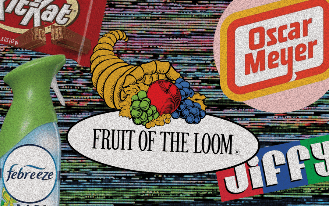
Take the Fruit of the Loom logo, for instance. Many people vividly recall a cornucopia behind the cluster of fruit—despite the fact that no such element has ever existed in the official design. What’s especially interesting is how specific that memory is. Not a plate or a wooden crate. A cornucopia. The horn-shaped harvest basket, popularized in Greek mythology and Thanksgiving iconography, is burned into our collective imagination.
The current logo, though detailed, stops short of offering that kind of iconic frame. Designers are taught that less is more, and too many layered elements can blur recall. It’s possible the logo is too crowded, too complicated—and when asked to remember it, our brains fill in the gaps with the most recognizable symbol available. Maybe if the logo were simpler, there would be fewer gaps to fill. Or maybe this is one of those rare cases where adding another element to an already busy logo might actually improve recall.
This fuzzy recall isn’t limited to images. Spelling mistakes are one of the most common Mandela Effects, especially for brands that use unconventional naming to stand out. Chick-fil-A, Skechers, and Febreze (or is it Febreeze?) are often misremembered simply because our brains are wired to auto-correct what “looks” wrong. Unusual spelling can help a brand carve out its own space, but if it’s too unfamiliar, it risks falling out of alignment with how people naturally read and remember words. In branding, memorability has to balance novelty with familiarity.
Another high-profile example involves Publishers Clearing House. For years, people have claimed to remember wrestling mogul Vince McMahon handing out giant checks in their commercials. In reality, McMahon worked with a competing company, American Family Publishers. But Publishers Clearing House had the more prominent name, and McMahon had the more memorable face. Over time, the stronger mental associations fused together. This shows how dominant brand names can overwrite nuance in the public imagination. It’s wild to think that American Family Publishers’ employment of McMahon may have actually strengthened their competitor’s brand.
Studies like the one from Signs.com, where Americans were asked to draw famous logos from memory, back this up. Very few participants could recall the Apple logo with full accuracy—several even added a stem. What this suggests is that even some of the most iconic logos in the world can blur at the edges when put to the test. Strong branding doesn’t just come down to visibility. It’s about clarity, consistency, and choosing elements that won’t get lost in the shuffle of the subconscious. And even then, some details may still slip through the cracks.
In the end, the Mandela Effect might just be a glitch in our mental filing system. But it also offers a fascinating glimpse into how people process—and misprocess—brands. The more we understand how memory works, the better we can design for it.
Recent Comments