Brand amnesia happens when a company changes so much that customers no longer recognize it. Rebrands, when done well, can modernize a company’s image and keep it relevant for new audiences. Done poorly, they can erase years of trust and recognition and waste millions of dollars.
The Perils of Changing Too Much
Consistency builds trust. Customers become attached to colors, shapes, and even the quirks of a logo. Those elements act as visual shortcuts in the brain. Remove too much at once, and the shortcut disappears. The result can be confusion, lost loyalty, and declining sales.
Tropicana’s 2009 Rebrand
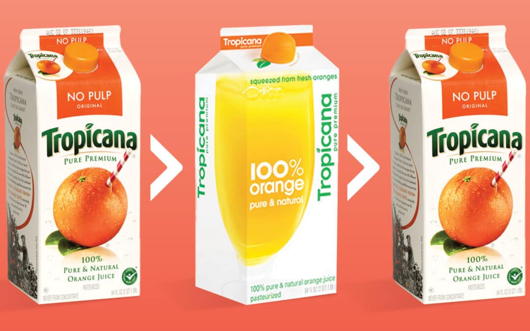
Tropicana decided to modernize its packaging in 2009. Out went the bright orange with a straw and bold green logo. In came a plain glass of juice with softer text and a more “minimal” look. The problem was that minimal also meant unrecognizable.
Within weeks, sales dropped 20 percent, losing the company over $50 million in revenue. Shoppers did not just miss the old design; they walked right past the new cartons, not realizing they were the same product. Tropicana quickly reversed the change and returned to its familiar look.
Eggo’s 2025 Refresh
Eggo recently updated its packaging, but it took a different approach. The company refined the typography, adjusted the layout, and freshened up the design. Most importantly, it kept the sunny yellow background, the iconic red script, and the warm nostalgic feeling that has been part of Eggo for decades.
The result feels modern but still unmistakably Eggo. Customers can spot it from across the aisle and know exactly what they are getting.
Tropicana vs. Eggo
Tropicana removed its most recognizable visual asset and replaced it with something generic. Eggo kept its strongest brand identifiers and built the refresh around them. One erased the brand’s personality. The other preserved it while polishing the details.
Other Brands That Learned the Hard Way
Gap changed its logo in 2010 and returned to the original within a week after widespread backlash.
Kraft tried a “modern” logo that did not connect with shoppers, then reverted to a more familiar design.
J.C. Penney simplified its look so much that it became bland and forgettable.
How to Avoid Brand Amnesia
- Keep your core identifiers intact, especially the ones customers recognize instantly.
- Test major changes with loyal customers before launch.
- Treat your logo, colors, and key visuals as valuable brand assets. They are not just decoration.
Closing Thought
A brand refresh should feel like a new haircut, not a witness protection relocation.
Customers should recognize you instantly, even if they notice something has been updated. Memory is a powerful marketing tool. Protect it.
Recent Comments