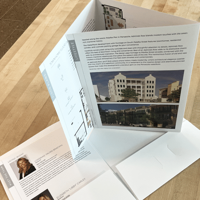
Are you confused about the difference between a brochure and a flyer? You’re not alone! Even though the documents are similar, the design and usage for each are completely different and many people are confused as to what to use when. And many graphic designers, brochure design agencies, and printers don’t know themselves! But fear not! As a well established Florida marketing agency, 3SIXTY Marketing Studio has many years of experience in graphic design, brochure printing and marketing so read on as we will set the record straight and guide you to the optimal product for your business!

Let’s talk flyers
A flyer is a full sheet of paper that is commonly used for disposable marketing. Use flyers when you want to create handouts to random people, or post them on bulletin boards.
Flyers can be single- or double-sided sheets. However, if you are posting your flyer, the single-sided will be your pick. But, if you are handing them out, then double-sided flyers might be a better option since you will have twice the real estate to use.
…so what’s a brochure?
Well, a brochure is also a full sheet of paper, but it is folded into two or three sections. A brochure is better if you have a lot of text since it can be divided into panels. A brochure requires more design and usually has a more complex layout than flyers.
Most brochures are double-sided and they can also be mailed.
What should it look like?
You want your flyer to impress – so the design should be powerful and loud. It has to capture the audience’s attention fast in order to get you the extra sales.
Your brochure will be full of information so it’s important that the text flows and is broken up so it doesn’t look too text-heavy. The design has to be creative but not over-powering. There is a fine balance there that the designer needs to pay attention to. There is more to the brochure design than meets the eye, which is one reason why you should hire a professional designer instead of canned templates. (But wait…there is more.)
Ok, but what about my message?
Glad you asked…and you probably already guessed it…the message is different between them as well.
Flyers need to be easy to read. No tiny text here! And remember what we just learned – for most folks, the first glance takes a few seconds. If it doesn’t look fun and interesting it will end up in the trash. (Which is another reason you should use a pro to design a piece that is custom made for you and will make your products and services stand out.)
A powerful headline is also essential – it will keep the person interested. For the content – keep it short, sweet and to the point. A cluttered look won’t do you any good. Tell the reader instantly why you are the best and why they should use you instead of your competition. It’s also a good idea to give the reader a call to action to use your company – so throw in a coupon into the mix.
The brochure will have a longer message with details about your company or service. It should have designated sections allocated to services, benefits of using your company, general info, etc. with a description for each section. It’s important that the brochure is designed correctly to keep the reader engaged. And, there are some areas on a brochure that are “higher value” real estate – hence that’s where your most important info should go.
Yeah, I hear you, you can save some dough by using a canned template, you say. Yup, sure can…but so can the competition standing next to you, fighting for the same audience, and what if his flyer or brochure looks like yours? That would be not-so-good. All of a sudden your services and products won’t look unique and it sends a message, unintentionally or not, that you don’t really care enough about your business to go the extra mile to make sure your clients know the difference.
So how do I know which is right for me?
If you just want to keep the information to a minimum and announce a new product, event or why they should use your service, then you should use a flyer.
However, if a potential client wants more in-depth info about what you offer, if they are already interested and thinking about buying from you but want to know a little more, then the brochure is your tool. A brochure gives you the chance to say more about your company and you can use it as a reference material. A good brochure is designed so customers can keep referring to them if needed. Use brochures when you need to describe, educate, persuade and provide specific details.
A final word
With all that said, flyers and brochures are both essential, and which one you choose depends on what you want to accomplish. Flyers you would use to communicate a small amount of information and to grab someone’s attention, while the brochure is the tool of choice to make prospect clients already showing interest in what you offer, feel confident before buying from you. When used correctly, you will significantly improve your sales.
Call me today and let’s get started!
3SIXTY Marketing Studio is a graphic design, brand, and marketing agency located in Northwest Florida. The owner, CC Milford, has over 30 years of experience in the graphic design and printing industry. We specialize in great-looking brochures, unique graphic design and continuously strive to offer the best in printing and service.
Let’s MAKE SOMETHING TOGETHER!
Shoot us an email and let us know what you need.


Recent Comments