Case Study
Pensacola Beach RV Resort rebrand
A beachfront brand built for adventure, legacy, and the next generation of RV travelers.

Client Overview
Pensacola Beach RV Resort is a popular beachfront RV destination that first opened in 2012. Located on the same property as a beloved tiki motel from the 1970s that was lost to a hurricane, the resort blends coastal history with a modern hospitality experience. As RV travel is evolving and a younger audience is entering the market, the resort needed a brand identity that reflected both its professionalism and its playful beachfront spirit.
Scope of work
- Brand strategy
- Visual identity design
- Logo
- Typography
- Color system
- Icons
- Patterns
- Brand axioms.
The Challenge
The existing logo and branding no longer matched the quality of the resort experience. While functional, the identity did not reflect modern design standards or the energy of Pensacola Beach itself.
Arriving on the island feels electric. Crossing the bridge is like dropping into a theme park full of color, motion, and personality. Many local businesses embrace that excitement through bold, memorable branding. Pensacola Beach RV Resort needed an identity that captured the fun of the destination while communicating the confidence and care of a professionally run resort.
At the same time, the audience was shifting. While many RV owners are Boomers, a new generation of RV travelers values experience, design, and storytelling. The brand had to welcome both.
Strategic Insight
One discovery changed everything. Pensacola Beach RV Resort is the only RV resort located directly on the beach within a 100-mile radius. That distinction became the cornerstone of the brand.
We also recognized a deeper truth about RV travelers. Even when comfort matters, the RV lifestyle is rooted in adventure. RVs are fun. People who choose them are drawn to freedom, exploration, and shared experiences. The brand needed to balance fun and professionalism without leaning too far in either direction.
The Solution
We built a visual identity system that feels adventurous, confident, and unmistakably beachfront.
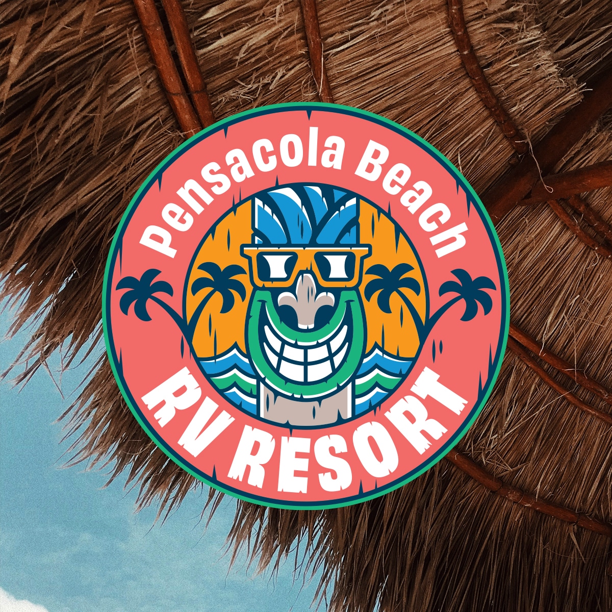
The design leaned into the property’s tiki heritage and its history as a Pensacola Beach staple. We invited the staff into the process, asking them to photograph their favorite tiki statues on the property. Their collective favorite became the foundation for a new brand mascot. We illustrated the tiki with palm trees and waves to reinforce the resort’s oceanfront location and create a welcoming, memorable icon.
Typography played a key role. We selected a bold primary typeface and customized it by removing chunks, creating a driftwood-inspired texture that mirrors the carved wood aesthetic of the tiki icon. A beachy script typeface was introduced to add warmth, beauty, and a subtle vintage feel that complements the resort’s history.
The color palette was drawn directly from two iconic Pensacola Beach landmarks. The sailfish sign at the base of the bridge and the Pensacola Beach Ball water tower. Blues, greens, reds, oranges, and yellows from these landmarks connect the resort to the visual language of the island itself. Subtly and powerfully, the brand signals that the resort belongs to the beach.
To support marketing, we developed a set of ten custom icons highlighting resort amenities. Hammocks, waves, surfboards, tiki drinks, sailboats, canoes, grills, bicycles, and a fish mid-bite all reinforce a sense of activity and ease. Two custom brand patterns extended the system further. One features coconuts, palm leaves, hibiscus flowers, nautical elements, and floral details. The second pattern showcases illustrated versions of additional tiki statues found across the property.
We also developed brand axioms designed for headlines and campaign use:
Beach or Bust
Park It on the Shore
Both reinforce the resort’s most powerful differentiator, its beachfront location.


The Results
The rebrand delivered a clear and confident visual direction supported by a complete identity system. The resort now has consistent tools across every touchpoint, from signage and digital marketing to merchandise and guest communications.
The new brand balances fun with professionalism, honors the property’s history, and positions Pensacola Beach RV Resort as a destination that feels iconic, intentional, and ready for the future.
Closing Insight
This project took an established Pensacola Beach staple and gave it a visual identity system worthy of its location. The result is a brand that feels as exciting as the drive over the bridge and as welcoming as the first night parked on the shore.


