Case Study
Hidden Oak Farm
A rustic venue brand built to showcase scale, story, and place.


Client Overview
Hidden Oak Farm is a destination wedding and events venue in Pace, Florida, offering expansive outdoor settings and multiple ceremony and reception locations across a large rural property. After coming under new ownership, the venue needed a brand update that would better reflect the quality of the experience and help it compete with popular regional and beach wedding venues.
The existing logo had been created in Canva and relied on a watercolor style that was difficult to reproduce consistently across signage, print, and digital applications. It also lacked the flexibility needed to represent the many distinct spaces available throughout the property.
Scope of work
Brand Strategy
Visual Identity Development, including:
- Primary logo system
- Sub-logos for individual event and ceremony locations
- Typography system
- Color palette
- Custom iconography
- Custom brand patterns
Verbal Identity Development, including:
- We Believe statement
- About
- Mission & Vision
- Brand Values
- Brand Personality
- Tone & Voice
- Messaging Framework
- BrandScript
All work was compiled into a comprehensive 24-page brand guidelines document.
The Challenge
While Hidden Oak Farm offers a premium experience defined by rustic beauty and open space, the existing branding did not communicate the scale, versatility, or professionalism of the venue. The owners were committed to keeping an oak tree as the central visual element, but oak imagery is common across venues and landscaping brands, making differentiation a key challenge.
In addition, the property’s size and variety of locations were difficult to convey through a single logo or static photography alone. The brand needed to help prospective clients understand that Hidden Oak Farm was not just one ceremony spot, but an expansive destination with many distinct settings.
Strategic Insight
Through discovery, we learned that the venue had a much higher success rate once couples visited the property in person. While existing photography was strong, it did not fully communicate the scale or diversity of the grounds.
This insight led us to recommend a brand system that could visually represent the full experience before a visit ever happened. Creating sub-logos for each ceremony and gathering location would allow the venue to showcase its breadth, while reinforcing the idea that Hidden Oak Farm was worth the drive. To further support this, we recommended drone walkthrough footage, both indoor and outdoor, to give prospective clients a clear, immersive understanding of the property.
The Solution
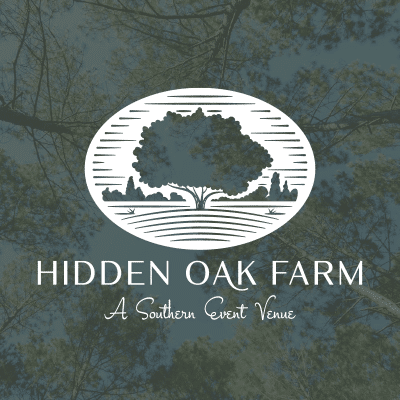
We developed a visual and verbal identity system that communicates expansive, rustic elegance. The primary logo centers on a custom-illustrated oak tree rendered in a woodcut style, conveying craftsmanship, heritage, and warmth while standing apart from more common oak imagery. By incorporating more of the landscape behind the tree, the logo subtly signals that the property offers far more than a single focal point.
That same woodcut style was applied across the entire visual system. Sub-logos were created for each ceremony and gathering space, including The Grand Oak, The Fields & Old Barn, The Lodge, The Orchard House, The Pines, The Ponds & Waterside Oak, Tree-Lined Drive, and The Goat Farm, a growing and unexpected part of the venue’s story.
In addition, we developed 15 custom woodcut-style icons, ranging from goats to the vintage jalopy used for photos, along with two custom patterns, one built from the icon set and another featuring the venue sub-logos.
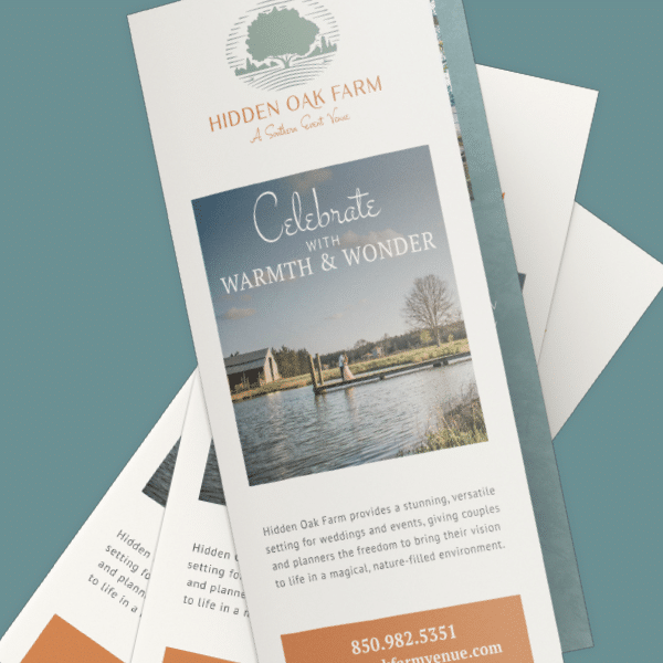
The typography system balances modern sans-serif letterforms with a traditional serif for subheads, complemented by a script style used sparingly for axioms and callouts. A light, earthy color palette reinforces approachability and rustic character.
The project concluded with a 24-page brand guidelines document defining both visual and verbal identity, and a cinematic walkthrough video designed to authentically showcase the scale and beauty of the grounds.
The Results
The rebrand positions Hidden Oak Farm as a premium destination venue rooted in place, purpose, and rustic beauty. The new identity provides clarity, flexibility, and distinction, helping prospective clients understand the full scope of the experience before ever setting foot on the property.
Read more about visual identity, vs. logo, vs verbal identity here.


